Devlog #8 - Companion Combat Revamp
Vagrus - The Riven Realms » Devlog
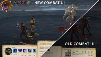
Let's talk combat for a second before continuing our Character design series with Part 2 (focusing on the conceptual phase of character design, like using moodboards for cultures, etc.) So, combat then!
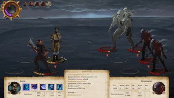
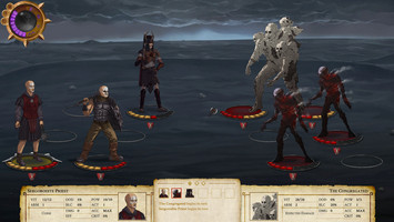
So based on the initial feedback and testing of the Companion combat, we have decided to revamp quite a lot of it. The process is still not fully complete, but you can already see the improvement on the images below.
Here’s how the old design looked like:
…and the new: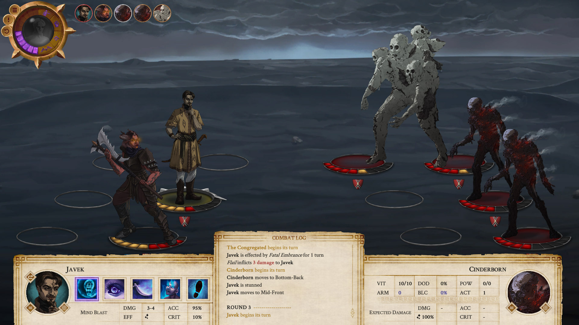
The main changes are:
- Skill icons have replaced the previous skill selection (the little scroll). This does not only give better combat field visibility but also adds flavor to all the character skills.
- Skill confirmation also changed. It used to be a graphical representation on the combat field but now is a second click on the target itself or the skill itself (once the target is selected). It’s a slicker solution that we are very satisfied with.
- Design changes that include simplified and more user friendly UI structures, tweaks to the position of the six combatants, and the initiative order. There are also a lot of little adjustments here and there, like the size and function of the combat log.
It’s always great to see how far we’ve come with a part of the game and we hope you are as excited as we are.
Website | Youtube | Twitter | Facebook | Instagram | Patreon | Discord
Get Vagrus - The Riven Realms
Download NowName your own price
Vagrus - The Riven Realms
A story-rich, turn-based RPG set in a cruel dark fantasy world.
| Status | In development |
| Author | Lost Pilgrims Studio |
| Genre | Role Playing |
| Tags | Atmospheric, Dark Fantasy, Fantasy, Narrative, Singleplayer, Story Rich, Strategy RPG, Turn-based, Turn-Based Combat |
| Languages | English |
Leave a comment
Log in with itch.io to leave a comment.